Restor.eco
Helping Organisations Understand Their Impact at a Glance

My Role
Co-Lead UX Designer – Interaction Design, Information Architecture, Visual Design, Collaboration with Development
Release
June 2025
Overview
Organisations on Restor were managing large portfolios of ecological sites without a central place to understand their combined impact. Their options were limited to checking sites one by one or publishing everything publicly, which didn’t work for organisations handling sensitive or partner-funded work.
I co-led the design of Restor’s organisation portfolio, defining the structure, portfolio tools and reporting views that brought these datasets together in a clear and practical way. This included smart portfolios that allowed users to focus on specific subsets of sites and share them safely with investors or partners.
The launch created a shift in how enterprise organisations used Restor, providing a reliable foundation for portfolio management, impact reporting and future insights across the platform.

Enterprise organisations on Restor managed large numbers of ecological sites but had no central place to understand their combined impact. Teams relied on checking sites individually or publishing them in a public collection, which was not suitable for organisations handling sensitive or partner-funded work. They needed a structured, secure way to view their full impact and share it selectively.
Site A
Site B
Site C
UI Component
Individual carbon data across different site
1
Understanding Organisational Workflows
We met with enterprise partners and internal teams to understand how large organisations managed their sites, reported on impact and collaborated with funders. These conversations clarified which metrics mattered most and how organisations expected to navigate their portfolio.
Research
Determining priorities with partners
2
Mapping What Data Could Be Combined
Working closely with development, we mapped which datasets could be aggregated safely. This also helped define how private information needed to be handled and what technical constraints existed around sharing.
Site
Site
Site
Aggregation Logic
Organisation Dashboard
Data
Combining multiple site data into one
3
Prototyping and Validating the Direction
We explored multiple layout concepts for the organisation dashboard, portfolios and smart portfolios. Early prototypes were shared with partner organisations and internal teams, which helped validate the direction and prioritise the first release.
Wireframe
Early look at Portfolio
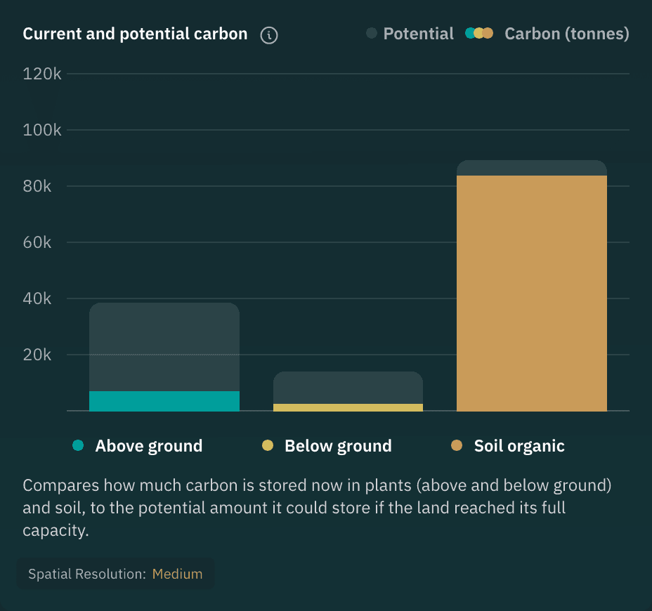
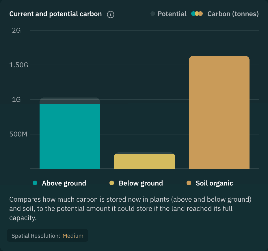
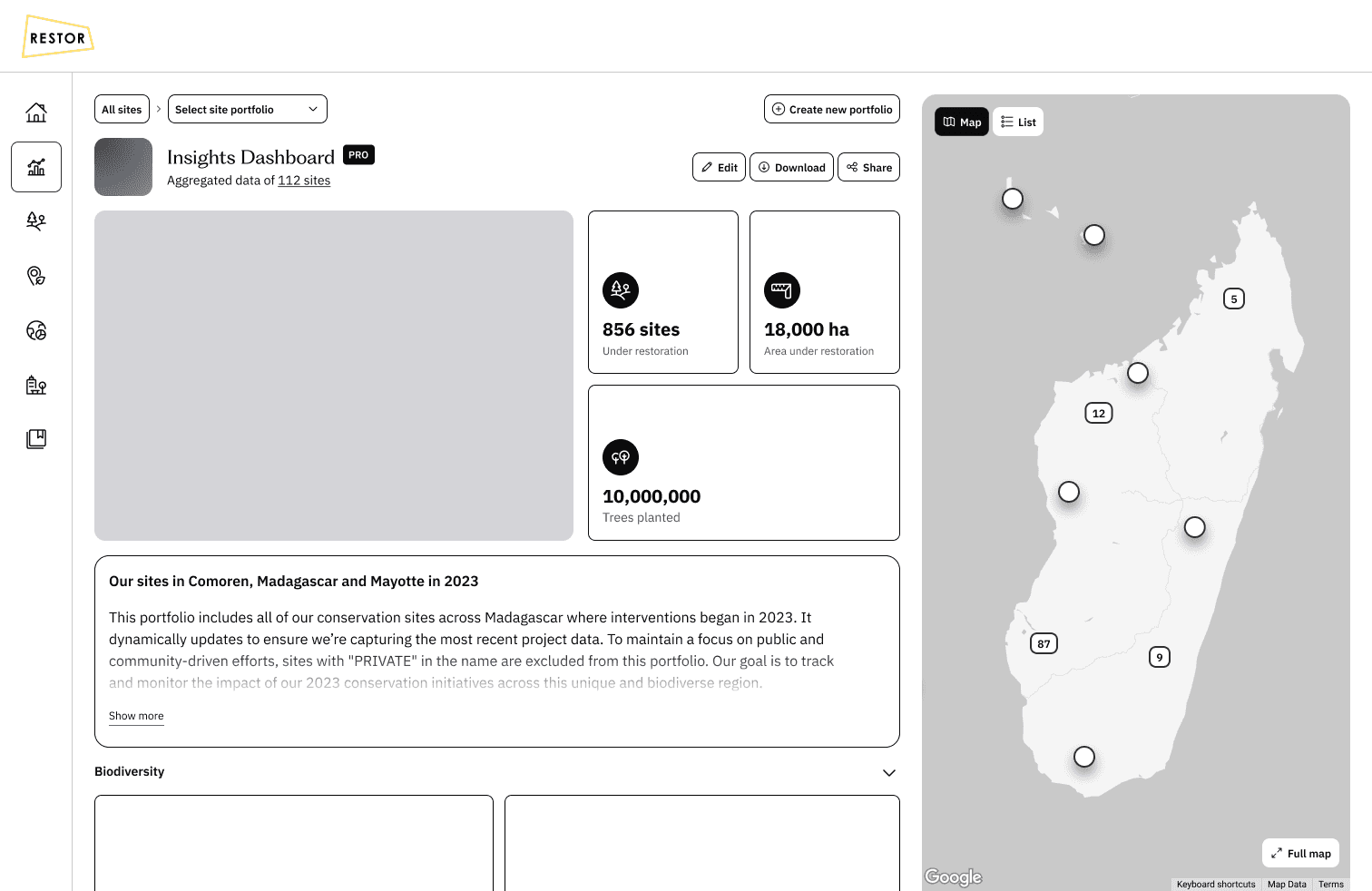
A Portfolio View That Made Organisational Impact Understandable
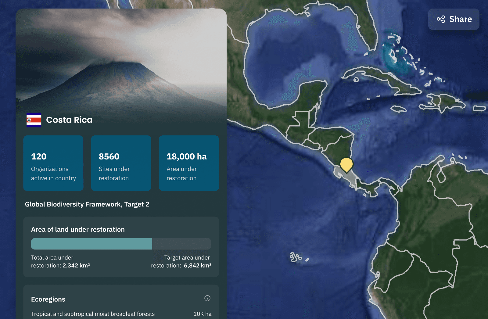
The new organisation dashboard brought all sites together in one structured view, something enterprise partners had been requesting for years. By prioritising metrics and trends over the map, organisations could finally understand their combined impact without opening dozens of individual sites. This made portfolio-level reporting far more efficient and reliable.
Image
A restructured overview that prioritises combined statistics and portfolio-level insights.
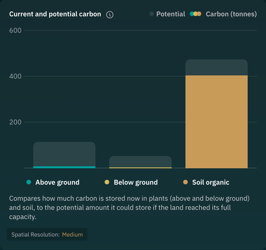
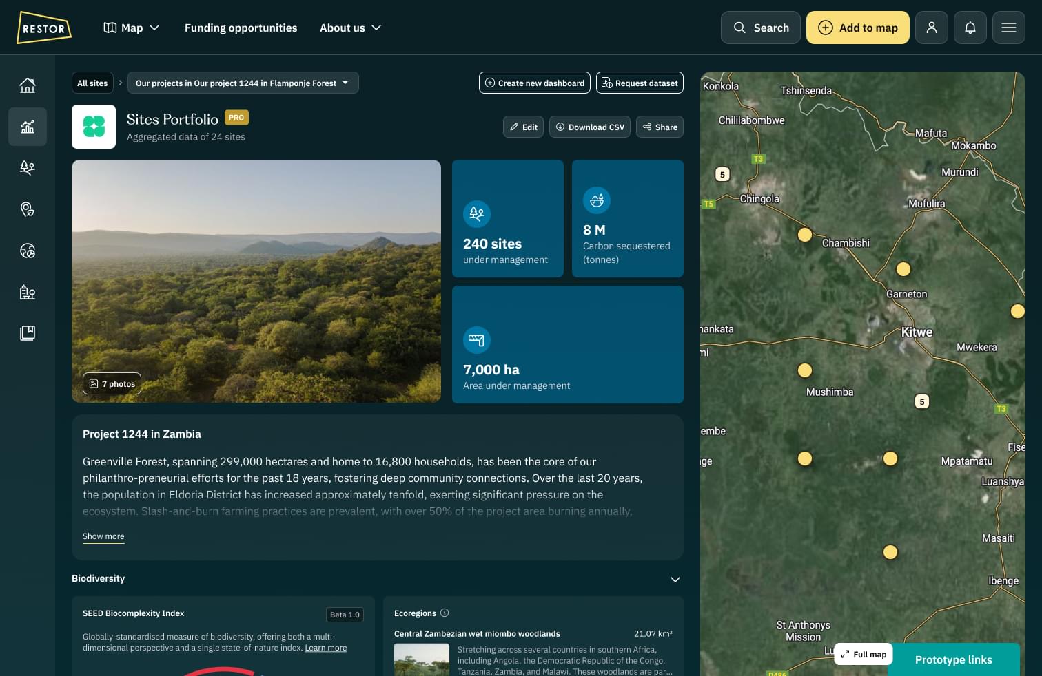
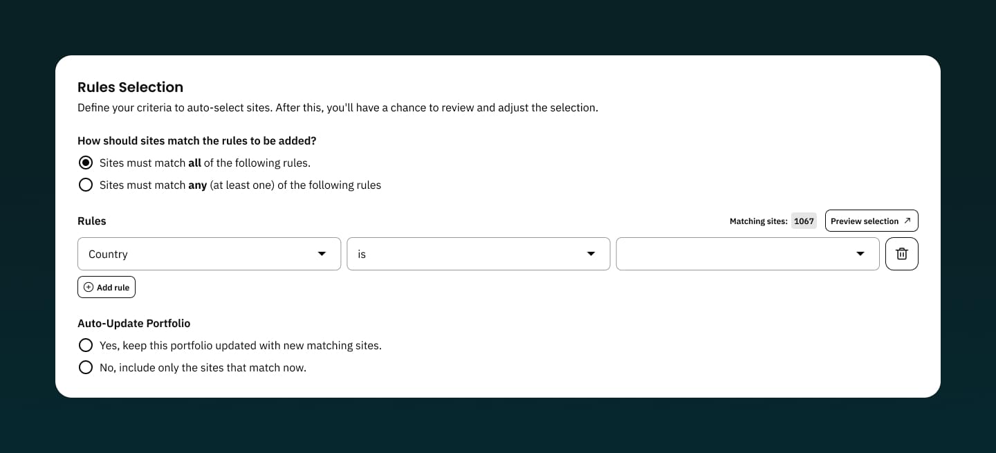
Flexible Subsets Through Smart Portfolios
Organisations often managed hundreds of sites across regions and partner programmes. Smart portfolios introduced a way to zoom in on meaningful subsets, starting with country-level filtering. This helped teams evaluate progress in context and supported internal reporting workflows that previously required manual data gathering.
Image
A restructured overview that prioritises combined statistics and portfolio-level insights.
Secure Sharing for Collaboration and Reporting
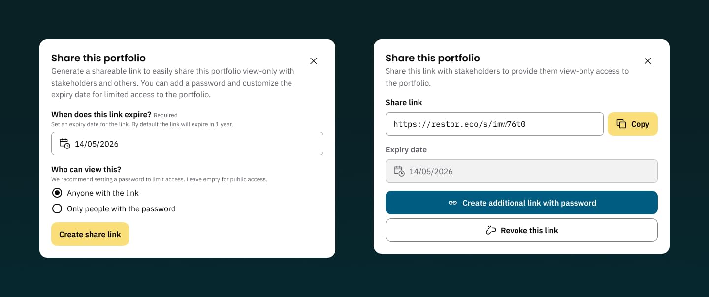
To support funder relationships and internal decision-making, organisations needed a way to share insights without exposing sensitive or partner-funded data. The new sharing flow provided private links, expiring access and optional passwords. This gave organisations confidence that reporting could happen safely and consistently.
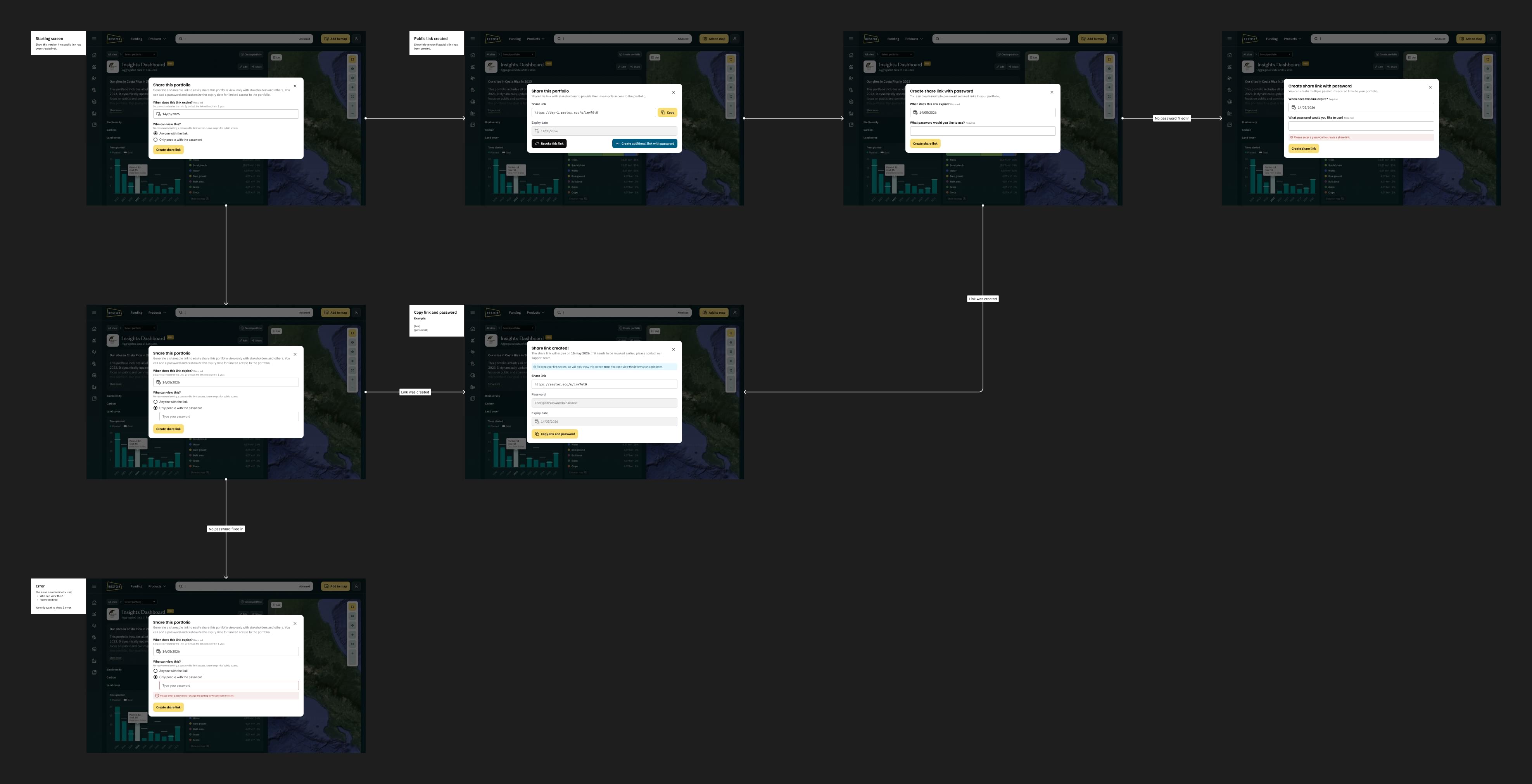
Image
Sharing controls include private links, optional passwords and expiration settings.
Image
Detailed sharing settings
A Foundation for Ongoing Growth
The dashboard quickly became part of pitches, partner reports and internal planning. During development, we also explored country-level portfolios and ways to surface top- and under-performing sites. Combining data at this scale openes new opportunities for government departments and larger NGOs.
Image
Sharing controls include private links, optional passwords and expiration settings.
Through this work, I gained a deeper appreciation for how enterprise organisations use data to guide their decisions. Bringing information together in a consistent structure revealed how much time it saves and how quickly teams can move when the right context is available. It strengthened my belief in the value of designing tools that make complex information immediately usable.
Feel free to e-mail me
KvK. 87662019